Apollo Syndrome: Coined in 1981 by Dr. Meredith Belbin “where teams of highly capable individuals can, collectively, perform badly.” Related to poor results of so-called Dream Teams and groups of experts. More here: https://www.teamtechnology.co.uk/tt/t-articl/apollo.htm
Rehbinder effect: Physical curiosity where metals and ceramics are easier to cut when a surfactant film is applied to the surface. Fun video demonstrating the effect when hammering a nail into a coffee cup with and without water: https://www.youtube.com/watch?v=Fcn0xzDr9D0
Jevons Paradox: Technology improves efficiency of resource use reducing incremental demand but falling costs causes overall increase in demand. Examples: coal use during Industrial Revolution; building roads leads to more traffic leads to more roads; Hall-Heroult process for aluminum refining
“You just have to be starting out, which is, anything you do can be fixed. What you cannot fix is the perfection of a blank page. What you cannot fix is that pristine, unsullied whiteness of a screen or a page with nothing on it, because there’s nothing there to fix.”
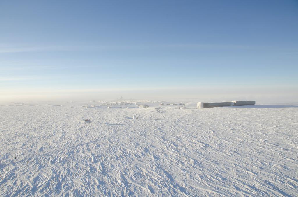
Winter is here (at least in the Northern hemisphere!) and with it comes days of howling winds and frigid temperatures that turn an unassuming backyard into a Hoth-esque landscape.
For more than a century, researchers have tried to quantify the extra misery that the cold, moving air inflicts on exposed skin, a.k.a. the Wind Chill Index. The first such index was borne from a study more than 80 years ago at an Army Base deep in the Antarctic Circle. Researchers took advantage of the extreme weather conditions to develop a model over a wide range of temperatures and wind speeds.
Three remarkable things about this study:
Simple instrumentation
Clever design
Surprising durability
Let’s dig in!
Simple instrumentation
Paul Siple and Charles Passel were part of the United States Antarctic Service that explored regions near the South pole between 1939 and 1941. While stationed at “Little America” in 1941, they performed a study to determine rates of “atmospheric cooling” over a range of temperatures and wind speeds. Although there were implications for broader adoption, the immediate interest was to inform personnel of the risk of frostbite based on weather conditions.
They sealed a bottle with 250 grams of water and a thermometer and hung it from a pole
Next to the bottle, they hung another thermometer and an anemometer to measure air temperature and wind speed
Once set, they measured the time from when the water began to freeze (temperature just above 32°F) and when the water completely froze (temperature just below 32°F)
A water bottle, two thermometers, an anemometer, and a stopwatch. That’s it!
Since the energy needed to freeze 250 grams of water was known (heat of fusion = 79.71 calories per gram), they could calculate the heat loss by dividing the total heat released by the time it took to freeze the water.
For example:
250 grams of water freezes in 15 minutes (0.25 hours)
(250 grams) x (79.71 calories/gram) = 19,925 calories lost
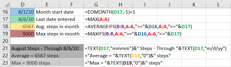
An important part of this work was making the results comparable to other research. No groups used identical experimental setups, so the cooling rate had to be generalizable by incorporating the surface area transferring heat from the water to the environment.
Using the example above, if the surface area was 0.5 square meters (m2) the cooling rate would be:
(79.71 kcal/hr) / (0.5 m2) = 159.42 kcal/m2/hr
Another unit with 5 m2 surface area and heat loss of 797.1 kcal/hr would have the same cooling rate:
(797.1 kcal/hr) / (5 m2) = 159.42 kcal/m2/hr
By using these units, the size of the apparatus does not matter. Cooling rates are all relative to one square meter.
Limited resources and instrumentation kept the setup simple but some ingenious experimental design and help from Mother Nature brought amazing value to the work.
Clever design
When building their experiment, Siple and Passel knew that the rate atmospheric cooling is affected by numerous factors:
Air temperature
Wind speed
Conduction – heat transfer through direct contact (e.g. handwarmers)
Radiation – heat transfer via electromagnetic waves (e.g. the sun)
Evaporation – heat transfer from vaporizing water (e.g. sweating)
Focused on air temperature and wind speed, they needed to minimize the effects of the other factors they had no control over. Fortunately, the Antarctic tundra provided climatic consistencies to assist!
Incoming radiation: The sun’s rays beating down on Earth from 93,000,000 miles away add warmth to even the coldest environment. By running the experiments in the dead of winter, the sun was far below the horizon and had no effect.
Outgoing radiation: A strange fact about radiation is that any object with a temperature above absolute zero will radiate heat to objects at lower temperatures, even a bottle of freezing water. Published research at the time noted that heat loss from radiation changes linearly with each degree of temperature change. In other words, if the air gets 1 degree colder, the water radiates another ~4 kcal/hr. Two degrees colder, ~8 kcal/hr. And so on. Armed with this information, Siple and Passel adjusted their equations accordingly.
Humidity: Evaporating water is a remarkably effective way to transfer heat and could have significantly affected their experimental results. However, the frigid air near the South pole holds only a negligible amount of water vapor. The miniscule amount of evaporation that occurred near the testing apparatus did not significantly affect the results and was subsequently ignored.
The combination of these fortuitous factors minimized the effects of variables Siple and Passel could not control and maximized the value of the measured variables of air temperature and wind speed.
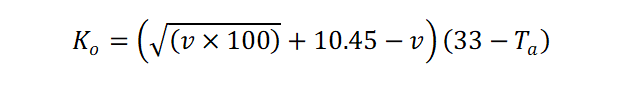
In total, Siple and Passel repeated their testing procedure 80+ times to build a mathematical model that correlated cooling rate with wind speed and air temperature:
Where:
Ko = Cooling rate in kcal/m2/hr
v = wind speed in meters per second
Ta = air temperature in °C
This formula generated a table of values that were somewhat esoteric. Yes, the bigger the number, the colder it feels outside, but how much colder?
This is where it gets crazy.
Siple, Passel, and their colleagues timedhow long it took for faces to freeze! They stood bare-headed facing the wind while the medical officer waited for their skin to lose all color, which coincided with a sharp twinge of pain. In one experiment, 11 subjects had their noses frozen while standing in -26.6°F (-32.5°C) with 16 mph winds (2000 kcal/m2/hr on their scale). On average, it took a minute for noses to freeze, including Passel who froze his nose four times in the experiment. That’s dedication!
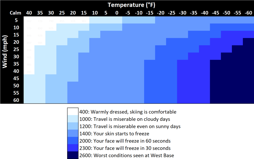
Based on similar experiments and other related research, they built a table with cooling rates ranging from 0 to 2600 kcal/m2/hr with corresponding comfort levels. Figure 1 is a heat map (or is it a cold map?) illustrating the degradation of conditions as the wind increases and air temperature decreases.
Figure 1: Heat map ofSiple and Passel cooling rate model with description of human comfort. Cooling rates in kcal/m2/hr
The dark blue section is beyond the worst conditions experienced by Siple and compatriots at West Base, which was noted was on September 4, 1940. Air temperatures dropped to between -58 to -65°F with winds of 11 to 16 mph, a cooling rate ~2600 kcal/m2/hr. Those conditions were abysmal, but on a later expedition to the South Pole, Siple recorded temperatures at -102°F on September 17, 1957, a deathly cooling rate of 3290 kcal/m2/hr.
Surprising durability
Siple and Passel’s model combined heat transfer theory and practical explanations to provide a great tool for Antarctic personnel. Reading air temperature and wind speed from the relative comfort of their shelter, they could gauge outdoor conditions, i.e. whether it was kind of dangerously cold or really dangerously cold outside. The model also gained broader acceptance in the meteorological community because it accomplished what others had failed to do: provide a simple way to gauge the coldness outside.
Variations of the model appeared through the years but it was not until 2001 before it was replaced by the present-day standard, more than 60 years after the original work!
The more highfalutin model calculates an “as feel” temperature instead of a cooling rate:
Wind Chill temperature = 35.74 + (0.6215 x T) – (35.75 x V0.16) + (0.4275 x T x V0.16)
Amazing results can come from simple set-ups with thoughtful design. Siple and Passel crafted a robust experimental setup and took advantage of the consistent Antarctic climate to create a remarkably durable result.
The beauty of this work is that it would be straightforward (not easy!) to repeat their experiments and verify the results. Research is fraught with results that are not reproducible. With Siple and Passel’s set up clearly described and easily obtainable equipment, one could imagine a savvy student from Saskatchewan replicating their work for a school project.
All that said, the next time you hear a meteorologist mention the wind chill, keep in mind those hearty souls hunkered down in a remote Army base to do a little science.
Stay warm in these frosty times!
Gratitude
Thanks for reading! Comment below about what you liked (or didn’t!) or hit me up on Twitter.
Many thanks to the Foster crew, especially Russell and Christine – for the edits and suggestions.
They make my writing better and could do the same for you!
Perhaps, you have experienced similar financial ills from Illinois Avenue or been bankrupted by Boardwalk. With this post, we will find the “hot” properties and why we land on them so much, why playing the odds doesn’t always work, and finish with some tips to stay financially solvent.
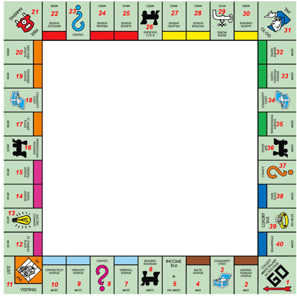
To start, there are 40 positions on the game board (numbered in red):
Figure 1: Monopoly game board. Positions numbers from 1 (GO) to 40 (Boardwalk)
During gameplay, we take turns rolling two, 6-sided dice, sum the total, and move that many spaces. Roll doubles and we roll again but roll three consecutive doubles and we go to jail for “speeding”.
If we land on any of the 22 properties (e.g. Boardwalk), four railroads (e.g. Reading Railroad), two utilities (Electric Company and Water Works), Income Tax, Luxury Tax, Free Parking, Jail, or GO, we remain there at the end of our turn.
Conversely, the other seven positions can cause additional movement . GO TO JAIL is self-explanatory. The others, three Community Chest and three Chance, lead to card draws for some unknown fate. While both 16-card decks contain “Advance to GO” and “Go directly to Jail”, Chance has eight more movement-inducing cards sending us to St. Charles Place, Illinois Avenue, Boardwalk, Reading Railroad, the next railroad, the nearest railroad, the next utility, or back three spaces.
There’s a lot going on, but already we see a couple of things:
1. We are going to jail. A lot!
One position is Jail. Another sends us to Jail. Cards send us to jail. “Speeding”? Jail. We will end our turn on jail more than any other position. This also has a secondary effect: Properties one or two rolls away from jail will see a bump up in their end of turn probabilities.
2. We probably won’t stay on Chance if we land there
Ten of the 16 cards send us elsewhere on the board. Chance should be the least frequent end of turn position. We should also end on positions called out by the cards, e.g. GO and Reading Railroad, more frequently than other places on the board.
With the mechanics in mind, let’s find those hot spots!
Methodology
We have two ways to find the probability of ending a turn on each property: analytical and empirical.
For an analytical solution, we need to identify every combination of 40 board positions, 216 dice roll combinations (to account for speeding), and 20,922,789,888,000 possible Chance and Community Chest decks. The numbers get astronomical in a hurry.
Option two is an empirical approach: play the game and count as we go. Looking at a 50-move game, the end of turn distribution might look like this:
Figure 2: End of turn distribution for a simulated 50-move game (left) and Monopoly game board (right).
In this game, we ended on some positions 8% of the time and several others not at all! There’s no way to tell where the true hot spots are based on this alone. We need more data. In fact, it takes about 20,000 games to reach a steady state where the probabilities change a negligible amount regardless of how many additional games we play. In other words, the probabilities after 20,000 games and 1,000,000 games look almost identical.
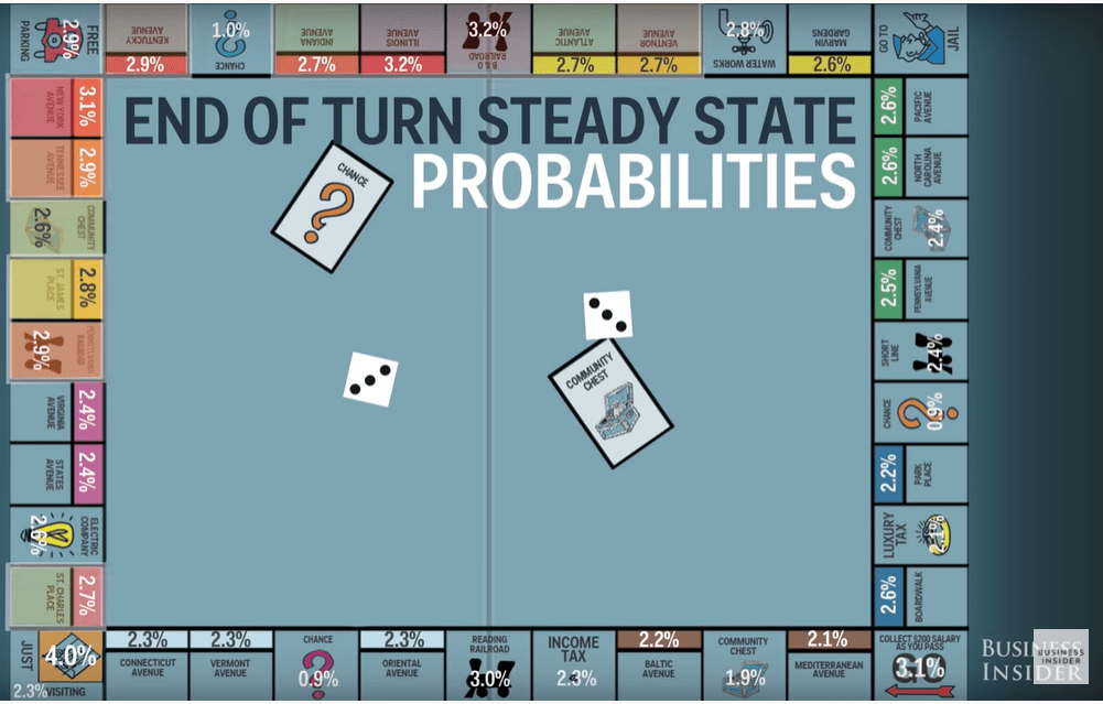
With normal play taking 60 minutes per game, it would take us over 800 days to hit steady state. Thankfully, computers are much more effective at this type of work! Business Insider, for example, put together this analysis:
All things equal, we land on each position 2.5% of the time. But they’re not equal. Jail, as expected, is tops at 6.3%. The top five properties are Illinois Ave (3.2%), B&O Railroad (3.2%), GO (3.1%), New York Avenue (3.1%), and Reading Railroad (3.0%). Note that all five are associated with Chance cards.
The bottom 3? All Chance. We knew it!
This is all very nice, but it still doesn’t explain Connecticut Avenue. How did a property with a 2.3% end of turn probability put me in the poor house?!?
It’s due to the chaotic nature of dice rolls and card draws that led to an unexpected (and unprofitable!) result. While the steady state analysis provides a good strategy, a single Monopoly game will never get to steady state. We expect to land on Connecticut Avenue once per 50-turn game (2.3% x 50 turns = 1.15) but it’s possible to land there over 12 times! I lost, in part, because my son snagged the property early on, built a hotel, and cashed in on my unlikely string of landings.
Rigging Monopoly in our favor
Steady state or no, we want to win! This succinct guide will improve our odds.
Some highlights:
1. Buy orange and red properties
These are on the hottest part of the board. Scoop ’em up, finish the monopoly, build houses, and collect that rent!
2. Build three houses on your monopolies ASAP
This provides the optimal balance of the cost to build houses and the benefit of higher rent. Properties with three houses make money back sooner than any other situation.
3. Stock up on railroads; avoid the utilities
Railroads rake in the rent, especially when we get all four. The utilities? Not so much.
With these tips and an understanding of the game’s statistics, we will be ready for our next Monopoly matchup. And while it might not make strategic sense, if my son even thinks about buying Connecticut Avenue, he’s grounded!
Gratitude
Thanks for reading! Comment below about what you liked (or didn’t!).
Another year of Daylight Savings Time (DST) is coming to an end and with it, the joy of an extra hour to sleep or celebrate.
It used to give me nightmares.
For a time, I managed an Excel file that tracked a production schedule. Operators entered in start times and the spreadsheet calculated when the process should end. This was very time-sensitive. Ending the process early caused significant operational issues. Delays led to lost production. Spreadsheets aren’t a great application for this, but 99.9% of the time we had no issues.
The 0.1% we did, DST was usually involved, which meant more than a few late nights of scrambling to get things right.
While the concept of shifting time twice a year is easy to understand, it’s reallyfreakinghard to account for the two hours out of 8760 per year that act differently. To the programmers make this a seamless change every time, I salute you! In honor of their brilliance and of humanity’s tendency to make things unnecessarily complicated, here is a brief history of DST with a touch of astronomy to explain why we mess with our clocks twice a year.
Let’s dive in.
DST started off as a joke by Benjamin Franklin no less. In 1784, his anonymous letter to Journal de Paris quipped that the French could save ~$200 million a year spent on candles if they only rose with the sun and retired at sundown. And with so much at stake, forcing citizens to comply only made sense! His suggestions?
Tax window shutters that blocked the sun
Ration out candles
Restrict nighttime travel to physicians, surgeons, and midwives
Ring out church bells and fire off cannons (!) at dawn
Alas, his brainchild would have to wait.
While Franklin’s cheeky missive was ignored, George Hudson, a New Zealand entomologist, renewed the cause with papers in 1895 and 1898 that proposed a 2-hour shift forward on March 1st and back on October 1st to make better use of daylight. This would also have conveniently supported his prodigious bug collecting interests! In 1907, Englishman William Willett published “The Waste of Daylight” that suggested a 20-minute shift on four consecutive weekends in April and September with similar effect. His persistent campaign eventually led Parliament to review a “Daylight Saving Bill” in 1908. It was initially mocked, but with some tweaks gained substantial support over the next few years, though not enough to become law.
That changed during World War I when Germany implemented sommerzeit or “summer time”, on April 30, 1916 in an effort to conserve coal. England followed suit shortly after on May 17th. The U.S. waited until March 31st, 1918, though its DST trial was short-lived nationally. Congress shut it down in October 1919 overriding President Woodrow Wilson’s veto in the process. However, DST lived on locally as some communities enjoyed the summer shift. By 1923, nearly 500 cities were in the DST camp.
The U.S. once again enacted year-round DST in 1942 during World War II, which united the nation’s time-changing ways, only to have them shut down again in 1945 at the end of the war. However, some states and cities continued to do their own thing for the next 20 years until the Department of Transportation got involved. Cross-country travel was gaining popularity and industries had a tough time keeping track of the mishmash of time changes throughout the country. The Uniform Time Act of 1966 forced states to adopt standard time or DST. Cities could no longer go rogue either, though the entire state could opt out of DST should they choose, which Arizona and Michigan did. Michigan opted back in to DST in 1972 while Arizona continues to go without as does Hawaii.
Globally, DST is all over the place. 178 countries currently don’t observe it. Of those, about 100 never have while the rest did at one point, but gave it up. The other 70 or so countries had a similarly tumultuous journey as the U.S. and ended up opting for the twice annual hourly shift. Wikipedia summarizes it nicely by country as does this map below:
In the Northern hemisphere, Mexico, the U.S., Canada, a few Middle Eastern countries, and a smattering of island nations observe DST. Most of Europe currently uses DST, however that will be changing as soon as 2021. The European Parliament voted to end the seasonal time change leaving each country to decide its standard time, though the Council of the European Union has yet to finalize its decision.
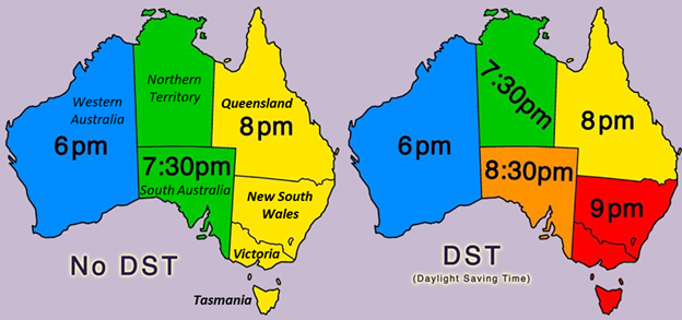
The Southern hemisphere has a much sparser adherence with Chile and Paraguay in South America, New Zealand, some more island nations, and about a third of Australia, which is worth a deeper look:
The 90-minute shift from Western to central Australia is odd enough, but it gets downright ridiculous during daylight savings.
As you can see from the map, geography, specifically latitude, plays a significant role in what countries practice DST. That’s because of a little thing astronomers call obliquity. Also known as axial tilt, the Earth spins on its axis at a different angle than it orbits the sun. Written descriptions of this are tough.
Gifs make it easier.
Take this car doing donuts, for example:
The rear tires spin about their axis perpendicular to the road. They also “orbit” around the center of the donut, parallel to the road. This corresponds to an axial tilt of 90°.
The Earth’s tilt is not as dramatic, currently ~23.4°, as shown here:
When the North pole leans toward the sun, the Northern hemisphere experiences summer and longer days. On the other end of the orbit, the North Pole tilts away from the sun leading to winter and shorter days. The variability in daylight hours becomes more extreme the further away from the equator. Note below how the Antarctic Circle is shielded from the sun during the June solstice (left) and the Arctic Circle is in darkness during the December solstice (right).
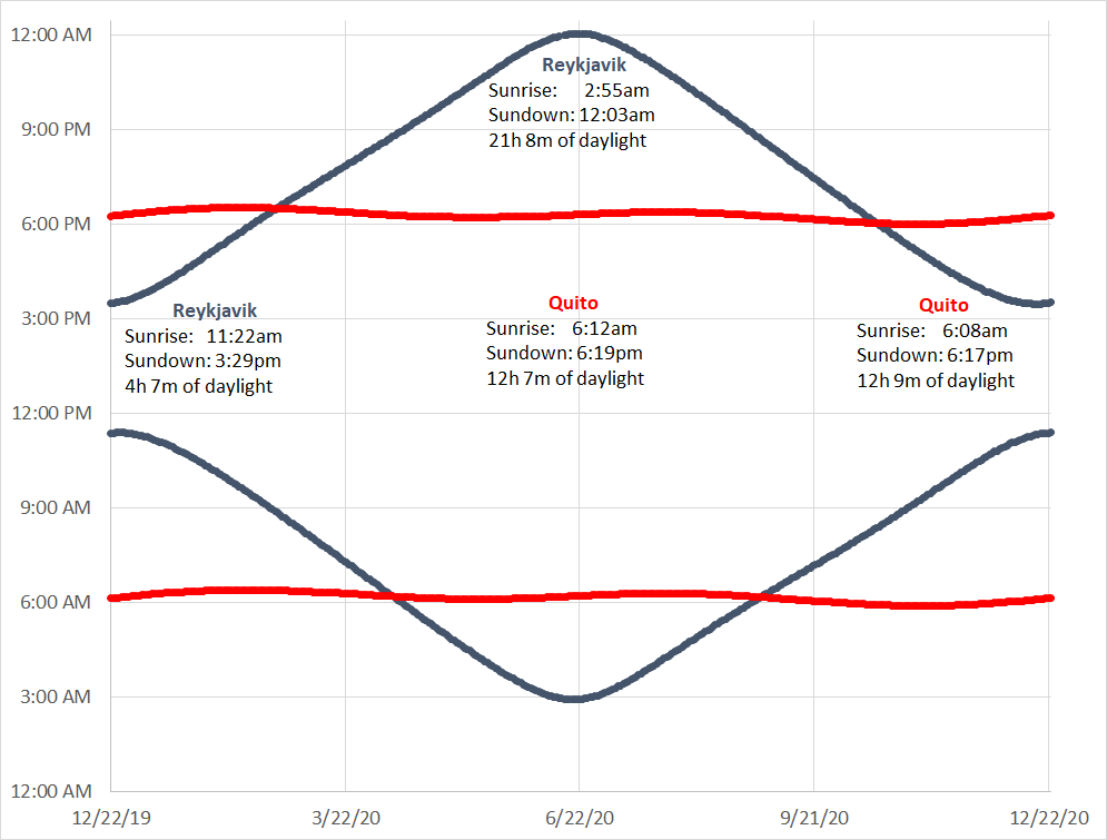
For a practical comparison, look at the times for sunrise and sundown for Quito, Ecuador and Reykjavik, Iceland over the course of a year. Quito, near the equator (latitude 0° 10’ S), remains nearly constant at ~12 hours of daylight while Reykjavik (latitude 64° 08’ N) goes from 4-hour days to 3-hour nights and back every year.
Cities near the equator see almost no variation in daylight hours. In Quito, sundown varies between 6:01pm and 6:31pm and sunrise varies between 5:58am and 6:24am. DST would only serve to throw a wrench into a perfectly stable day! On the other hand, Reykjavik is so far away from the equator that days and nights get REALLY long. DST would move sundown from midnight to 1am on the summer solstice. If the lack nighttime didn’t mess you up, the hour shift would do the trick!
Daylight Savings Time continues to be an oddity of mankind. Its satirical beginning from an American statesman advocating wake-up calls with artillery fire only adds to its colorful history. In a hundred years it may be nothing but a distant memory. Until then, some of us will keep on springing forward and falling back.
I’m just thankful I don’t have to program my phone to do the same.
I originally called this post “Dynamic Chart Titles in Excel”.
SEO-friendly, perhaps. But it could have been catastrophic.
In weaponized form, that five-word combination could unleash a wave of drowsiness not seen in modern times. Even in an 11-point font, it will cause you to blink for a second or two longer than normal.
Use with caution!
This post takes the tedious task of updating an Excel chart title and makes it less painful. Typically, we send the same chart to the same people day after day after day after day…
You get the point.
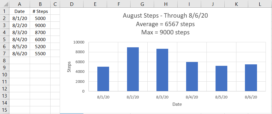
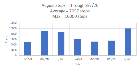
To get us started, we’ll use a sample chart looking at my daily steps so far in August:
I want to track my daily step average and maximum step count for the month. I also want the chart to update when I add more data. The axis titles, “Steps” (y-axis) and “Date” (x-axis), stay the same but my chart title will change every day I add more information.
Doing this manually gets very old very quickly.
Any data moves require a micro-adjustment to the title. No biggie until you realize that three minutes of daily tweaks costs you 12.5 hours of labor per year.
Egad!
No need to fret, however. We can do it automatically.
Building the statistics
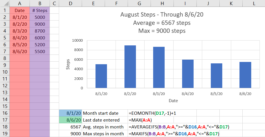
To start, we need to determine the month’s start date, last day of data entered, average steps for the month, and month’s maximum steps.
Briefly reviewing these formulae:
Month start date: EOMONTH(DATE, 0) returns the last day of DATE’s month (e.g. 7/5/2020 will yield 7/31/2020). EOMONTH(DATE, -1) yields the last day of last month. By adding 1, we get to the start of the current month!
Last date entered: Excel converts dates into the number of days after January 1, 1900 (or 1/1/1904 for some Mac users). The largest number is the most recent date, hence the use of MAX().
Avg. steps in month: AVERAGEIFS() will average together all values in Column B with corresponding values, i.e. in the same row, that satisfy all conditions of the expression. For example, B2 (value of 5000) will only be included if A2 (value of 8/1/20) is between the start of the month (D16 or 8/1/20) and the last date entered (D17 or 8/6/20). Since it satisfies all conditions, it is averaged in.
Max. steps in month: Similarly, MAXIFS() finds the largest value of Column B with corresponding dates between 8/1/20 and 8/6/20.
Building the title
Now, we can create a descriptive title that updates as we add more data by combining three separate lines:
August Steps – Through 8/6/20
Average = 6567 steps
Max = 9000 steps
The TEXT() function and ampersand “&” will come in handy. Observe:
For the first title line (cell D21), we use TEXT() in two ways:
TEXT(D17,”mmmm”) converts “8/6/20” into month’s full name, i.e. “August”
TEXT(D17,”m/d/yy”) maintains the “m/d/yy” format in the formula result. Without it, “44049” would appear in its place.
For more details on date formats used with the TEXT() function, check out this post.
Using “&” we can stitch together “August” with “ Steps – Through “ and “8/6/20” to complete the line. Keep in mind that spaces are importantin the connecting text. Sans spaces, “AugustSteps-Through8/6/20” borders on unreadable.
TEXT(D18,”0”) in cell D22 and TEXT(D19,”0”) in cell
D23 keep each formula result as an integer for tidy reporting. Without it, August’s average becomes 6566.66666666667 steps, an impressive (though ridiculous!) display of accuracy to within 10 picosteps. “Average = “ and “Max = “ are tied with their corresponding statistic with “&” to complete each line.
To finish the title, we use “&” to combine these three lines (i.e. D21, D22,and D23) with line breaks (a.k.a. carriage returns) as shown in Cell M25 below (bordered in red). Hold down the “Alt” key and then press “Enter” to insert the carriage return. (Akin to “Shift+Return” used in several apps to insert a line without sending a message.) This keeps the title clean with each statistic on a separate line.
Cell D25 (bordered in purple) is the output, though there is no evidence of carriage returns. That’s ok. We will see them in a second.
Our chart is now ready for the final step!
Automating the title
Select the chart title’s text box and click in the formula bar toward the top of the page. Instead of typing in text, select cell D25 to reference our well-crafted title!
Voila!
Now comes the fun part. When we enter the next day’s data, the title updates automatically! Let’s try 10,000 steps for August 7th and see what happens:
Bingo!
All our stats updated, including the new max steps for August, just by adding the data. A couple extra minutes of work should save you a ton time going ahead!
Thank you for reading! Feel free to add your comments below – what you liked or other Excel tricks worth learning about.
These questions are nearly impossible to answer accurately without extensive research. Enrico Fermi, 1938 Nobel Laureate and nuclear power forefather, was known for accurately estimating similarly hard-to-know answers with next to no information and posing similar questions. Most famously, he estimated the power of a nuclear blast by dropping bits of paper as the shockwave passed and then measuring how far they blew away. His estimate of 10 kilotons was amazingly close to the official U.S. Department of Energy 21-kiloton yield determined 50 years later using gamma-ray spectroscopy, whatever that is. His crude measurement led to a reasonable estimate within minutes. The actual answer took decades to determine.
Incredible.
Using Fermi’s technique of applying known concepts and quantities, we too can develop strategies to estimate hard-to-know answers with little effort and decent accuracy. In short, turn a random, nonsensical wild-ass guess into ascientific wild-ass guess or SWAG.
Munching on a chocolate creme Oreo the other day, I noticed a reversed wafer and wondered about Mondelēz’s quality control process. I also pondered how many Oreos are manufactured in the U.S. every year. For kicks, instead of Googling the answer right away, I opted to estimate it first, a la Fermi, and then see how I did.
First: Population of the U.S.
I hear 300 and 330 million people get thrown around in the news.
300 million is rounder, we’ll start there.
Second: Number of households
Two people per household seems low. Four seems high. Three sounds good.
300 million people / 3 people per household = 100 million households
Third: Households that consume Oreos
Oreos are popular but stores are stocked with all kinds of cookies. Maybe ten percent? Why not.
100 million households * 10% = 10 million households consuming Oreos
Fourth: Oreos consumed per household per year
My own empirical evidence suggests one bag of Oreos consumed per week
Each bag has ~40 cookies (varies based on standard size, Family Size, etc.)
40 cookies/week x 52 weeks/year = 2,080
Call it 2,000 Oreos per household per year.
Fifth: Final estimate
10 million households * 2,000 cookies per household per year
20 billion Oreos consumed per year.
That’s a lot of cookies.
How did I do? Well, somewhere between horrific and abysmal.
But that’s ok!
It turns out, the U.S. Oreo production is not readily available, at least where I was looking.
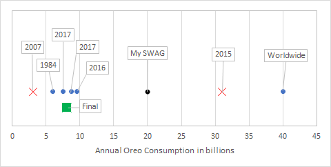
Combining these results, estimates range from 3 to 32 billion Oreos per year. However, the 2007 and 2015 results seem to be oddballs compared to the other four. Our range narrows considerably to 6 to 9.6 billion per year once we throw those out. But now we’re stuck. Without official U.S. production data, there is no great way to narrow the range further.
All said, I’ll go with 8 billion Oreos per year and call it a day.
Summary of Oreo production: Labels are year of estimate. Included data Excluded data My SWAG Final estimate
Two things I found useful from this exploration:
Billions vs. millions
I had no idea how Oreos Americans eat annually. Before this, if someone asked me how many million are consumed annually, I would assume the number must be between 1 and 1000. In the best case, I’m off by a factor of 10! It turns out, my SWAG was bad, but not that bad.
For more extreme examples, try these questions out:
How many thousands of dollars is Amazon worth?
How many billions of people will read this blog post?
Messes with your head, doesn’t it?
Using “thousands” or “billions” frames the answer between 1 and 1000 when the right answer is either much smaller or much larger. It is surprisingly persuasive, especially without prior knowledge.
Time vs. accuracy
My SWAG took about two minutes to build. The “close enough” result took about three hours of trawling through 10-K forms, press releases, and obscure blog posts to determine.
It took me 100 times longer to find a slightly more accurate answer.
For the sole purpose of satisfying a curiosity, that can be hard to justify. Spending more time makes sense when accuracy is valuable, be it marketing or physics.
Well, that was fun! Now you’ll have to excuse me. I have a tall glass of milk and a stack of Double Stufs to attend to.
A bit of fruitful construction last year led to the replacement of old deck railing and addition of a line of 2×6 along the base to make the framework of the deck less visible. Not much has happened since then as I waited for the boards to weather before adding paint. In the meantime, the bottom boards around the deck had gaps that needed to be closed up. A simple concept, though execution proved to be difficult. At first, at least.
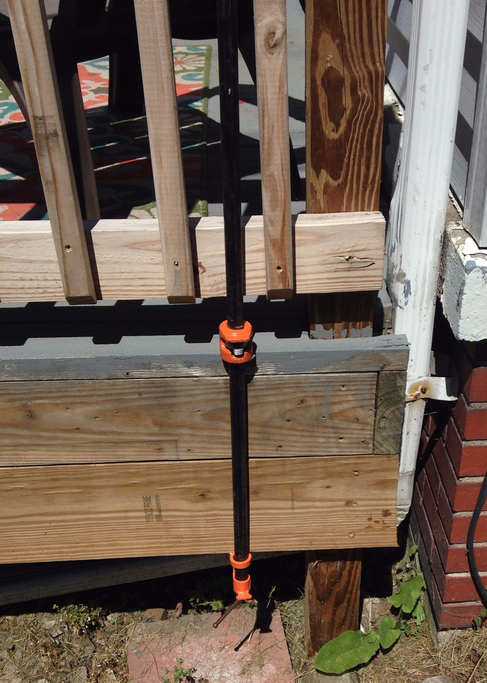
I unscrewed the lower boards from the deck, fiddled around with some hand clamps, adjusted, re-adjusted, reattached the boards, detached the boards, muttered to myself, reattached the boards, and stood back to see that little progress had been made despite the half-hour or so of effort. In the first few minutes of this bit of futility, my neighbor offer a pipe clamp to help out. I politely declined, thanked him, and then went back to my bout of inefficiency. What was a pipe clamp anyway? It could not be *that* helpful. Still, my curiosity was piqued and back I went to take up his offer.
Game. Changer.
The design is simple enough. Two pieces slide over a piece of pipe. One piece adjusts up and down to hold on to the surface to be compressed, wedging itself into the bar when force is applied. The second piece includes a screw that drives itself toward the other end to squeeze them together, hence the clamping effect.
Here it is in action:
This beautiful tool saved my afternoon and allowed to make short work of what was turning into a rather daunting task. It even straightened out a warped section of board that would otherwise still be there. It also served as a humble reminder of how little I know about these tricks of the trade. Like so many challenges and tasks we are faced with, the vast majority have been solved and done so in elegant fashion. It often takes asking the right question or having the right person see what your problem is. The trick is figuring out what question to ask or finding that expert. How do you do that?
www.expii.com is worth a look too with various problem solving sets in math and science set up by Carnegie Mellon math professor Po-Shen Loh, National Coach of the USA International Math Olympiad team.
Georgia Tech hosts a pi mile road race, which has run since 1975, and is actually a 5k (3.1068 miles, not 3.14159265… miles) since a change in 2002. This is, confusingly, not run on pi day, but toward the end of April. A portion of the course is on the Tyler Brown Pi-Mile Trail on campus dedicated to a former student government president and military serviceman killed in action in Iraq in 2004.

.png)